9 Charts That Show What Education in America is Like in 2017
December 29, 2017
By: Isabel Fattal
Source: The Atlantic
As trends in education ebb and flow, it gets hard to keep track of the current state of things. Visuals can clarify what’s changed over the past year and what has stayed the same. As 2017 comes to a close, we’ve compiled some graphs and charts that help contextualize the year in education issues.
College Access
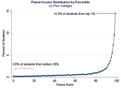
The accessibility of elite colleges to low-income students has long been a topic of concern in higher-education debates. Recent research by Stanford’s Raj Chetty, based on data on students born between 1980 and 1991, conveyed the urgency of the problem: among the cohorts of students at elite colleges that his team studied, just 3.8 percent of students came from the bottom 20 percent of families, while 14.5 percent were raised as 1-percenters.